Overview
I partnered with the owner and staff of Atlanta’s of Café Lucia to gain an understanding of business needs and customer pain points. We identified what makes the café unique for its customers and the shortcomings of the existing touchpoints. Building on this insight, I developed a visual identity to capture the spirit of the café and created menus to streamline kitchen operations.
01 / Identity
no more beans
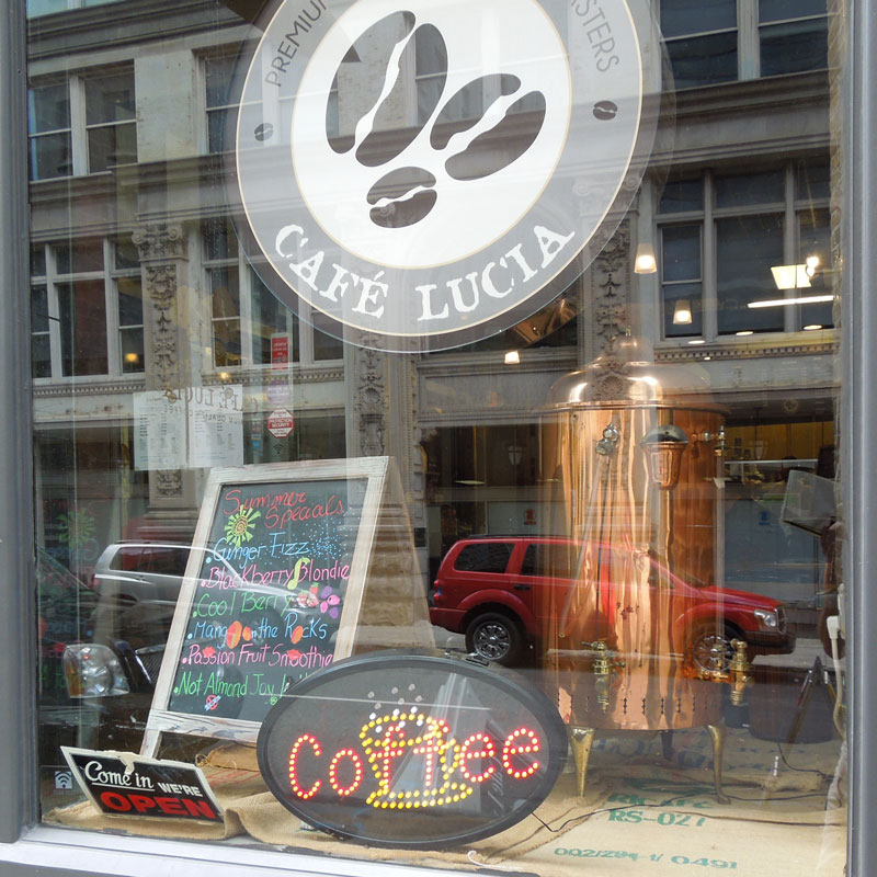
Drawing inspiration from the antique coffee roaster displayed in the storefront window, I created a mark that nods to the Healy building’s history while signaling the craft and authenticity behind the product.
02 / Signage
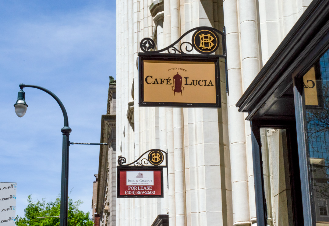
↑ From the beginning, I knew the logo would appear on the historic Healy Building in downtown Atlanta, so I designed it to harmonize in color and proportion with the building’s decorative sign bracket.
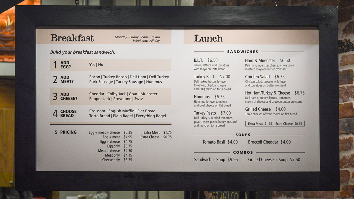
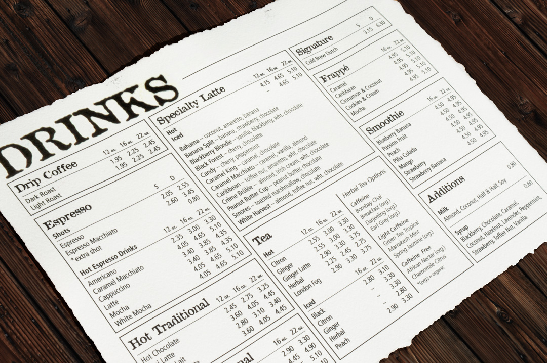
↑ The goal here was a clean menu that guides customers through their orders. This design drastically improved efficiency by standardizing how cashiers communicate with kitchen staff.
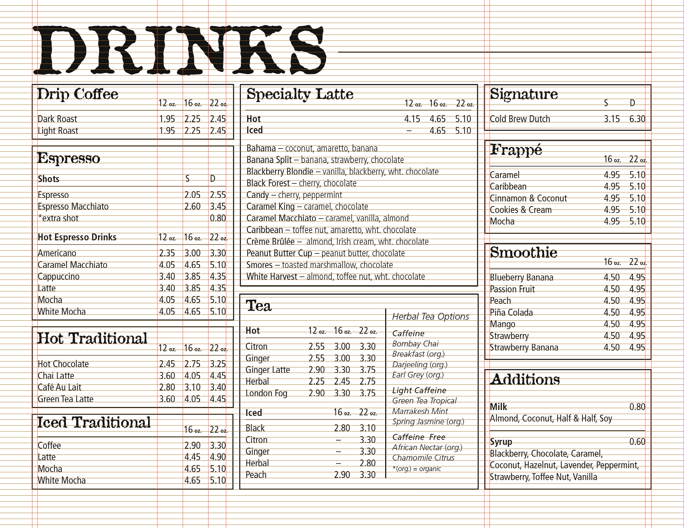
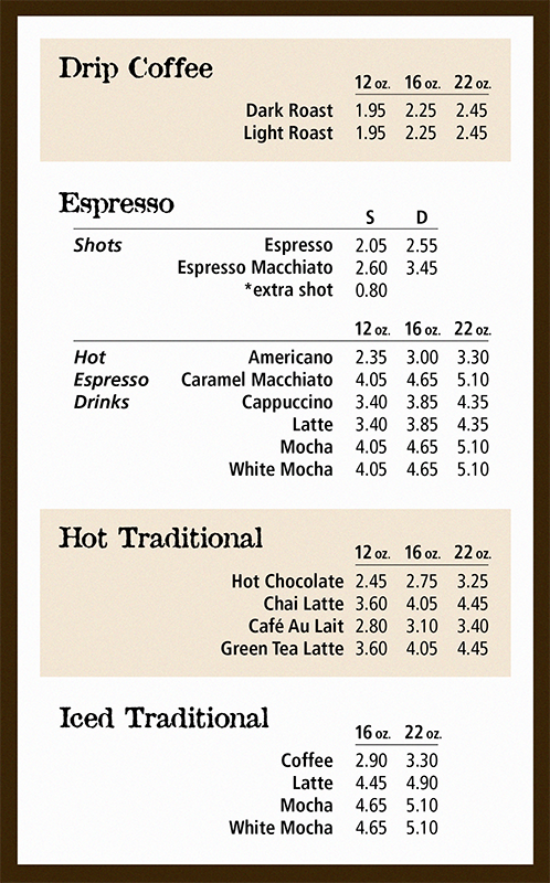
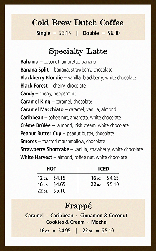
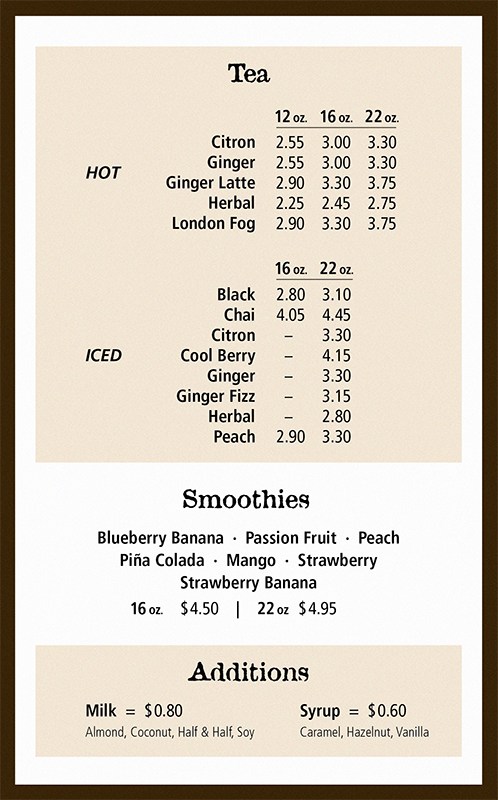
↓ During the morning coffee rush, customers need to rapidly peruse many options. I finessed and finessed this type to achieve maximum legibility and order.
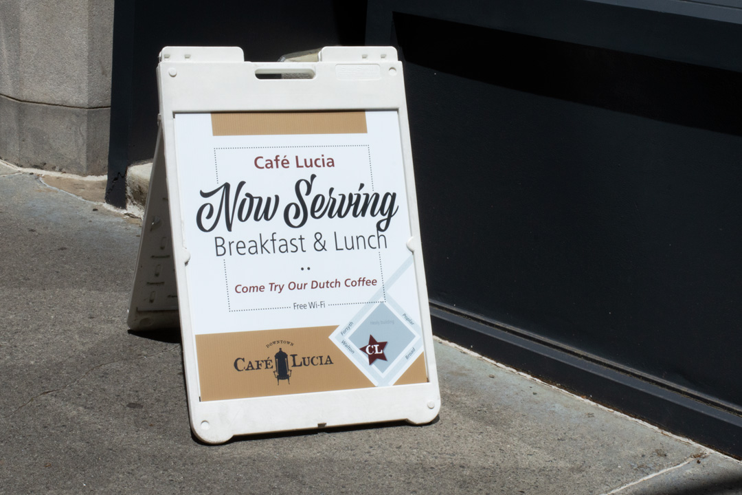
↑ A street sign that included a mini-map because customers often had difficulty finding the entrance.
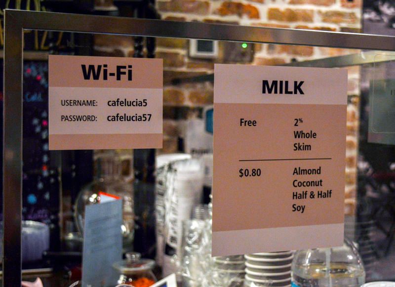
Simple. Clean. Cohesive.
03 / Menu
